Warren Ellis is the award-winning writer of graphic novels like TRANSMETROPOLITAN, FELL, MINISTRY OF SPACE and PLANETARY, and the author of the New York Times-bestselling GUN MACHINE, the “underground classic” novel CROOKED LITTLE VEIN and the Amazon Top 100 novella NORMAL. The movie RED is based on his graphic novel of the same name. He is the creator, writer and co-producer of the four-season Netflix series CASTLEVANIA, and of the six-part audio drama THE DEPARTMENT OF MIDNIGHT starring James Callis. He lives in south-east England.
MANAGER — Angela Cheng Caplan, Cheng Caplan Company
LITERARY AGENT — David Hale Smith at Inkwell Management
LEGAL - Joel VanderKloot at VanderKloot Law
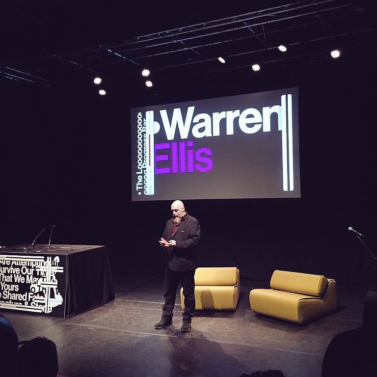
Please note that Warren Ellis no longer attends comics conventions or literary events, nor accepts speaking engagements, and is no longer accessible through social media.
Warren Ellis’ newsletter ORBITAL OPERATIONS can be subscribed to here.
(The previous version of this website was repeatedly compromised by hackers and the hosting company were no help in preventing it, so it has moved to the excellent blot.im for a simple static site. Apologies to anyone looking for that archive. More recent logs are still up at warrenellis.ltd. Consider this little page a cottagecore solution.)